🚇
Ventra App Redesign
Critique and analysis using studied design principles
UX Designer | Team Project | 2022/5 weeks
OverviewThe task of the project was to perform a critique and redesign of an interactive system. The purpose of this assignment is to provide practice in analysis using studied design principles.
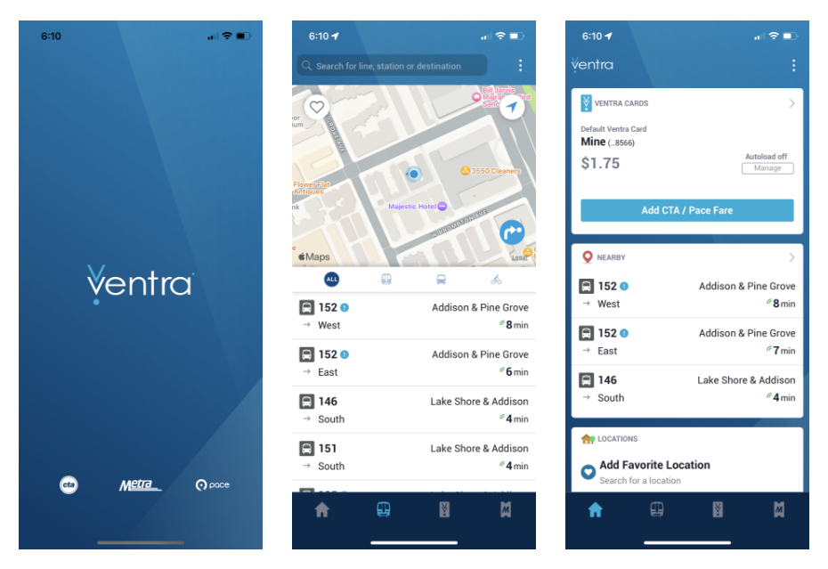
The Ventra mobile app is an app used by CTA riders in Chicago with capabilities including, but not limited to:
adding CTA or Pace fare to Ventra cards
purchasing Metra tickets
tracking buses and trains
planning routes
While there are many available apps and websites to track buses and trains, this is the only app that allows a Ventra user to add fare on a mobile device.
RoleThis was a project completed with another designer for a course at DePaul. The critique and final design were completed equally, while I conducted the user research and Card Management redesign.
Critique
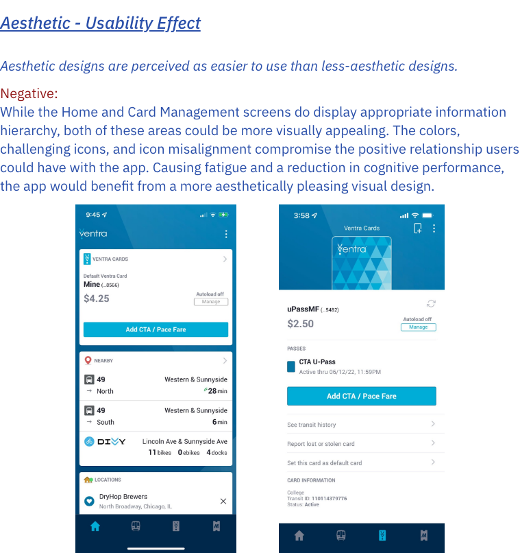
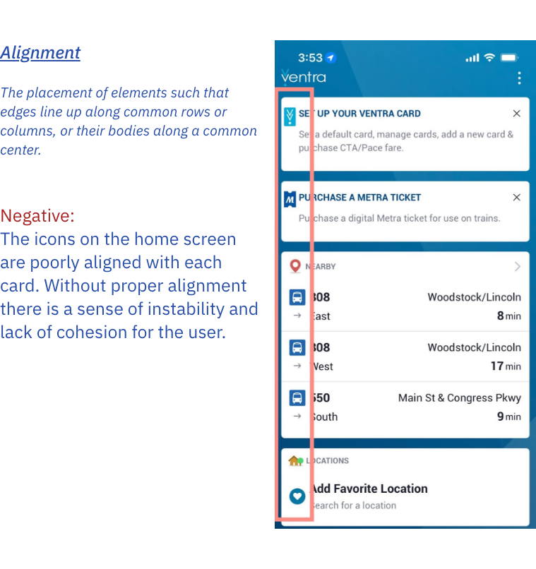
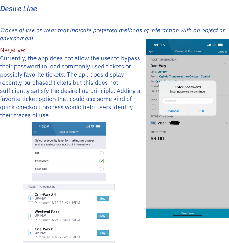
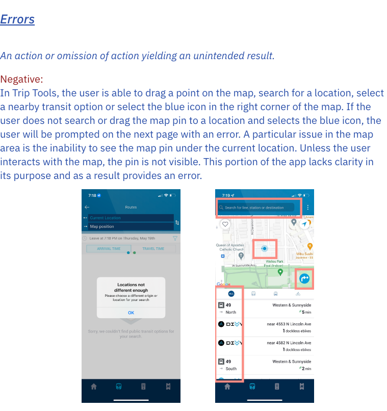
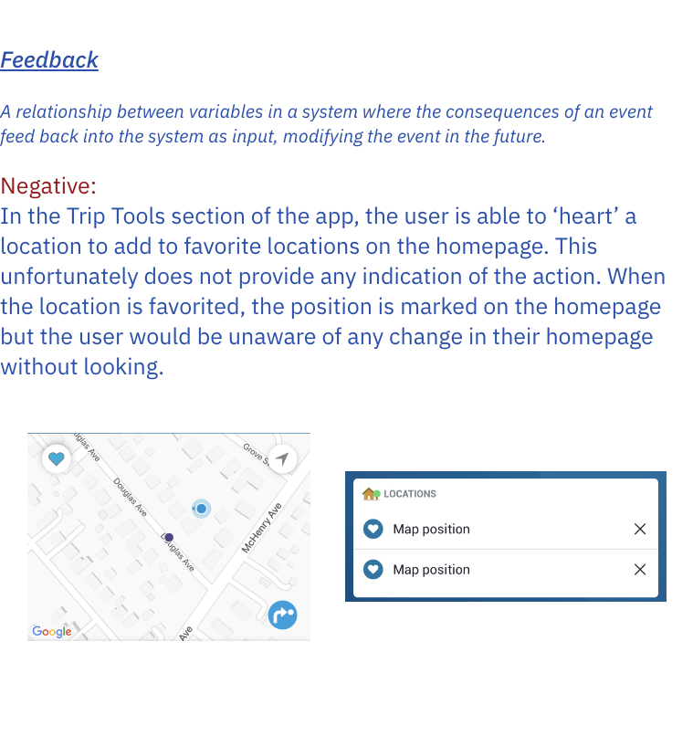
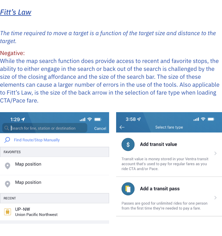
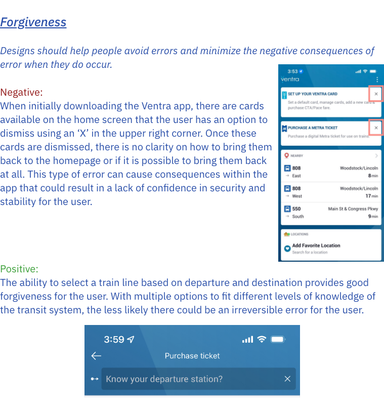
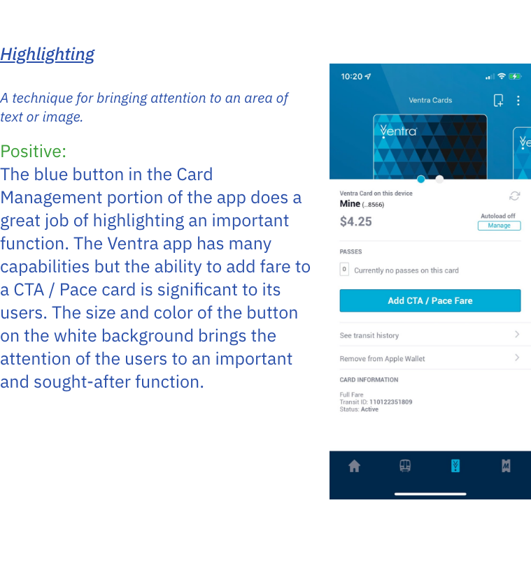
Based on studied design principles, we performed a critique that revealed weak points in the current design. We found that the CTA app has important capabilities, but information display and design are inefficient. Better functional design and information structure could improve usability.
Process
User Research
After we performed the critique to gain an understanding of pain points from a heuristic perspective, we conducted some small-scale user research by distributing a survey to a few participants. The insights we gained helped us form our user personas.
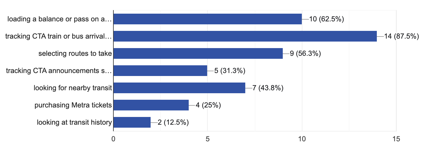
Some of the most popular features on the app are:
Train and bus tracking
Loading a balance or pass on a Ventra card
Selecting routes to take
InsightsWhat features do you use in CTA tracking apps?
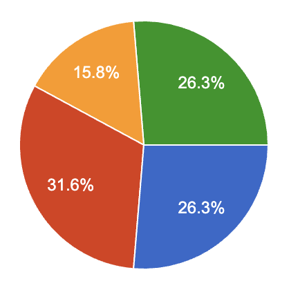
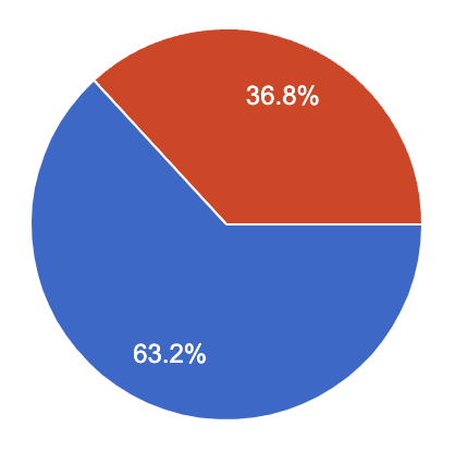
Of the 14 participants that reported using the CTA at least once a week, 2 of the participants do not use the Ventra app.
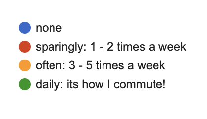
How often do you ride the CTA?
Do you use the Ventra app?
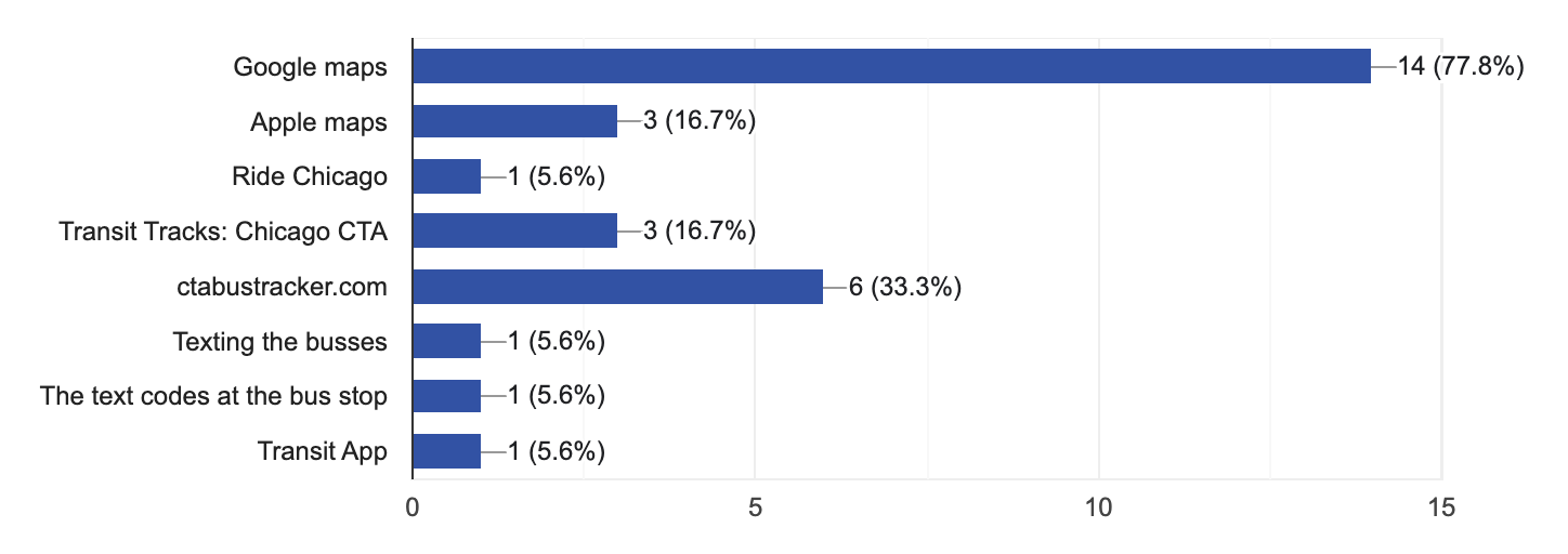
Participants reported using numerous other apps that mainly functioned as trackers. The CTA makes their data available to be used in third-party apps for tracking purposes.
What additional apps (if any) do you use for CTA /Ventra related things?
User Personas
Following our user research, we formed user personas to help further contextualize the needs of CTA app users.
Design Brief
The main design problems with the Ventra app are the ways information is displayed, the clarity of features, and the functionality of the design. Home, Trip Tools, Card Management, and Metra ticket purchasing are all portions of the app that could benefit from changes. While the focus of this redesign will be on the Card Management and Metra Ticket Purchasing portions of the app, global style changes will be implemented as well.
Objectives1. Create a Home tab that is more visually appealing and appropriately displays information.
Align icons and increase their size to decrease errors and aid in accessibility
Update the global aesthetic
2. Adjust the Trip Tools tab to minimize errors and clarify its use.
Change iconography for clarity
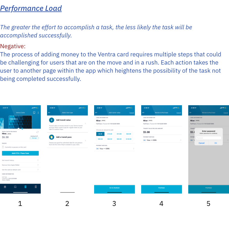
3. Rearrange the process of Card Management to reduce performance load.
Display multiple cards at once for ease of selection
Limit steps in the fare purchasing task
4. Cultivate a positive relationship with Metra ticket purchasing through implementation of Fitt’s Law and traces of use.
Implement passcode
Allow the view of recent/favorited tickets
Final Design
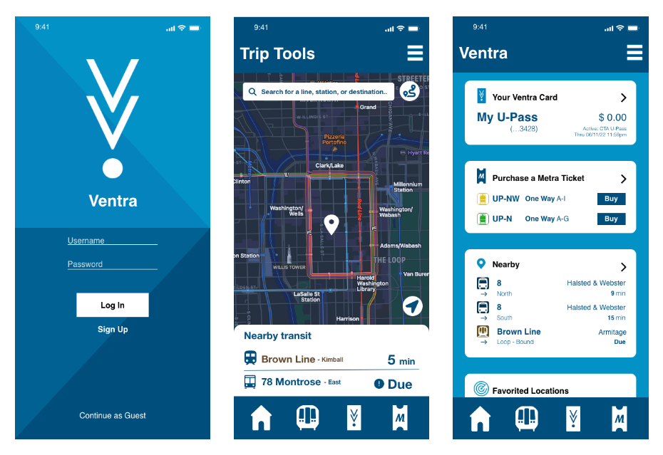
Main Pages
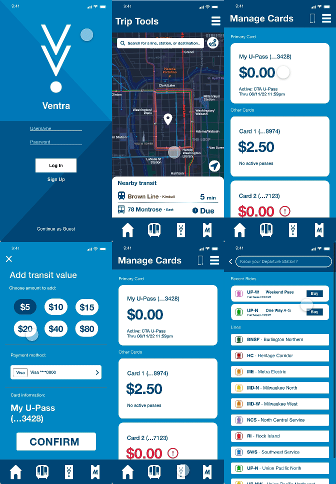
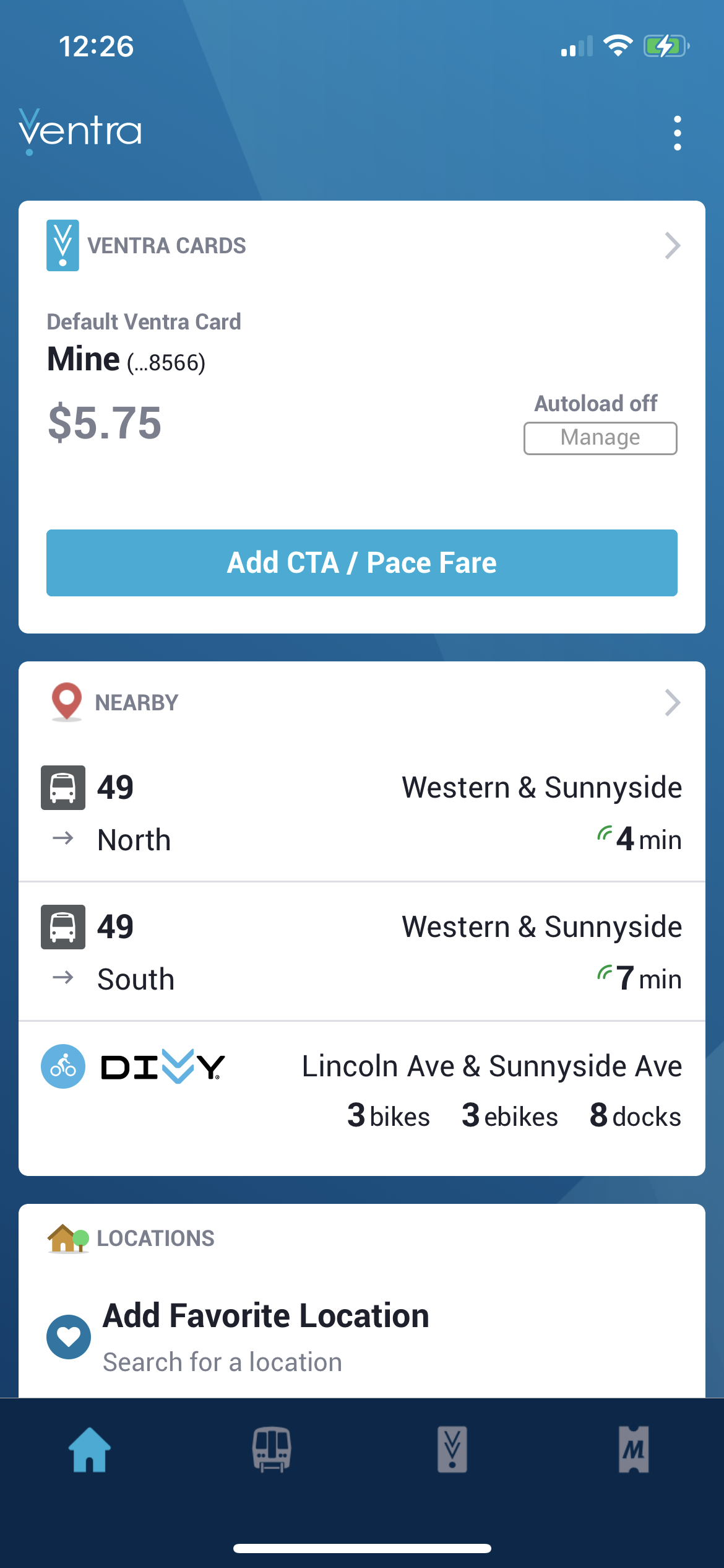
For the main pages, we cleaned up iconography and alignment to produce a more pleasing design for the user.
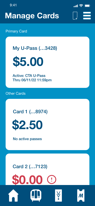
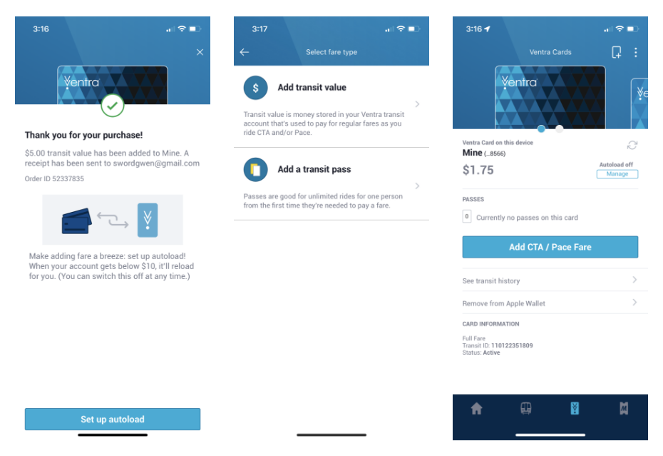
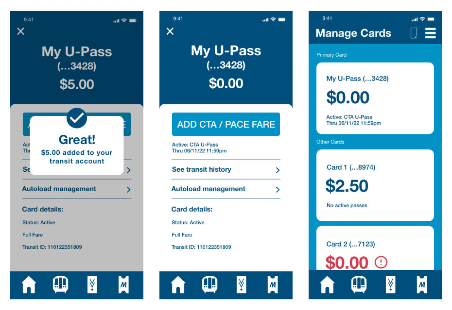
OriginalRedesignCard Management
For the card management portion of the app, the UI was updated to reduce the performance load of adding fare to the card, as well as emphasized elements aesthetically to consider the user operating the app on the go.
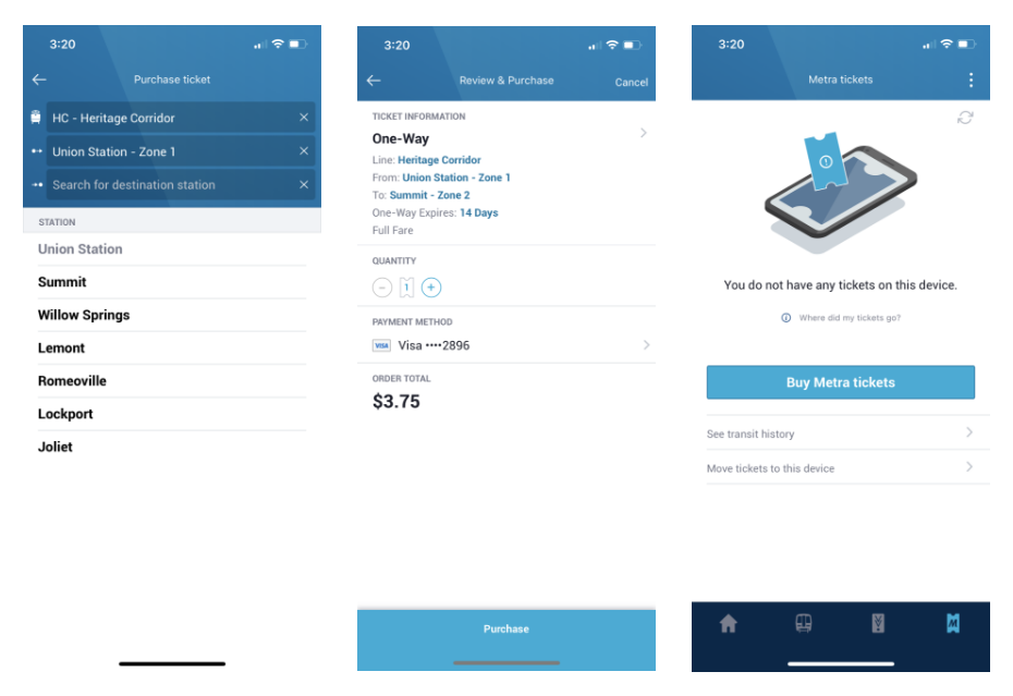
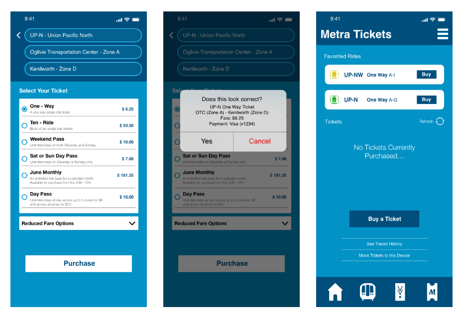
OriginalRedesignMetra Ticket Purchasing
In addition to an aesthetic update, the Metra ticket purchasing portion was redesigned to offer more clarity in the ticket search and an option to view frequented/favorited rides. Not pictured here, the update also implemented a passcode to purchase instead of entering the user’s account password.
OriginalRedesignReflection
While this app was function prior to the redesign, the use of usability heuristics in our critique allowed us to find holes in the overall usability of the app. By evaluating the design based on usability we were able to pick out holes in the design and move forward without totally changing the visual design.
This project was helpful for my growth as a designer because it allowed me to continue to study design principles and focus on identifying the pain points of a design to better improve its usability.
StrengthsTwo of the app’s primary uses (purchasing fare and Metra tickets) are more efficient
Improved information hierarchy and clarity
Introduced aesthetic changes meant to aid in convenience and accessibility
Weaknesses / TradeoffsThe timing on the project didn’t allow for as in-depth of a change in Trip Tools and the Home screen
The introduction of a passcode would necessitate a new task for the user to accomplish when initially setting up the app
